Finding Vivian Maier; Secondary sourced research, watched and took information from the video on Amazon Prime.
About; It is a documentary about the life and career of the mysterious nanny Vivian Maier and her collections of 100,000 of photographs – these photographs were secretly taken/hidden in storage lockers and discovered decades later. She is among of the 20th century’s greatest photographers.
Facts;
She photographed Chicago scenes in the 1950s and 1960s.
Vivian Maier worked as a nanny her whole life – she worked with families in New York and Chicago from 1951 to 1993.
When her employers asked who she was, she would reply with ‘I am sort of a spy’.
Vivian Maier was American but everyone thought she was French – she spoke with a strong French accent, probably in memory of her mother’s family (native from France, where she spent a few years).
Vivian Maier went around the city with a Rolleiflex camera – it allowed her to take intimate and natural portraits of the strangers she would meet. The shootings were from above, she could take photographs without being noticed.
Vivian Maier suffered from Syllogomany – characterised by compulsive and excessive accumulation of objects, no matter how useless and valueless they may be. When Vivian Maier arrived in her family, she would warn her future employers: ‘ I must tell you that I come with my life, and my life is in boxes’.
Watching and researching into this documentary has made me what to look into this artist and topic further as it is an unusual documentary and I have found interest and fascination from watching it.
Further Questions about the documentary I would like to know/research;
Why was she so fascinated with taking images of people?
Why did she keep her work a secret, why didn’t she display her talent?
Did she want to be a nanny or was that an act?
Did her diagnosis effect her job of photography?
Watching a full length documentary is different than my usual source of research such as Google, newspaper, images, etc. I prefer watching videos and documentaries as I am a visual learner so I will collect more information from watching videos and films. It also means I have a range of information and I get a sense of her life and her point of view from the videos.
Shown above, are my notes for the FMP presentation – covering AO7 and AO8 of the checklist. I digitally wrote up brief notes explaining each slide.
Feedback –
Displayed above, is a screenshot of my given feedback for the presentation relating to my final piece. I believe, I could improve my confidence and use less notes and base of my own words rather than reading out. This would improve my body language and the presentation altogether as it’ll seem as the presentation is practiced more. To also improve my presentation, I would have expanded on my slides – including videos, links, etc to interest the viewer and audience further. With my presentation, I could off brought in physical samples such as plastic bottles, my own work, secondary work from organisations, etc to build up my research and final samples and sources.
Looking at positives; I believe I talked covering most of the needed subjects, answered questions given and briefly evaluated my own work. On my slides, I inserted a range of images and text referring to what questions needed to be answered. I also showed links to artists work and my own work and I connect the pieces via inspiration and influential views.
Overall, I am pleased with the work I had for my presentation and the slides. This was an effective learning tool to what I could improve on and what was successful for Year 2 and any future presentations.
Looking over the year, I have worked with familiar and unknown techniques to myself. Working digitally with Adobe software and experimenting on how to alternate imagery, colour and text to develop graphics. Working within printmaking techniques such as Lino print, dry-point etching and using primary/secondary sources to work from. Also, experimenting with three-dimensional pieces and ceramics sculpture artwork that pushed myself out of my comfort zone. Our final major project, ‘Cause and Action’, was a way we could experiment with a range of techniques to promote, advertise or issue a chosen movement/cause or charity. The aim for our project, was to produce a ‘collection’ of samples that relate to our chosen topic and that either; sends a message, promotes, states any helpful information or is a realisation to any viewers. It is a way we can express our own creativity and artwork in a meaningful approach. For my theme of the ‘Cause and Action’ project, I chose to evaluate the on-going issue of plastic pollution in our oceans and water – how it is affecting our world and how this problem can be prevented or decreased. I chose to develop on this issue as it is broadly spoken about and our planet is desperately needing to breathe without any plastic polluted.
Mind Map – 08/03/2021Mind Map – 09/03/2021
I approached my theme, by creating my own mind map and having a mind map from a group discussion. Looking at movements and charities within the topic, we found; wellbeing – KOOTH, Mind, SAFA and Cancer Care. Social Issues – FRANK, Feed The Children and By The Bay. Animals & Nature – Surfers Against Sewage, BOOM,WWF, Dog Trust, Wildlife Trust, RSPCA and Bird Life International. Lastly, Political & Equality – Black Lives Matter, Stop Racism, Period Poverty, Women’s Rights and Stop Hate UK. All of the movements and charities displayed above, are peer/group discussed.
Personally, I was looking forward to expanding and developing my digital, camera and graphic design skills and techniques. Using Adobe software (Illustrator and Photoshop) to improve primary and secondary images or producing work. Mainly, I am interested in the graphic design and photography side of this course. So, I was looking forward to see how I could promote recycling and reducing plastic waste in a digital format. To elaborate, I was also looking forward to tutor-led workshops on printmaking and textile work as I would off liked to broaden my skill range. Lastly, I was looking forward to the secondary research of my chosen organisation. Reviewing their social media platforms, their clothing merchandise and evaluating graphics – fonts, typography, logos, colour schemes, etc.
On the other hand, I wanted to develop other skills such as time managing and punctuality. In my opinion, I struggle with time management by not completing the work until the deadline. Also, I believe I struggle in the forms of punctuation – sentences not making clear sense and being un-readable.
Unfortunately due to the current pandemic occurring, we were not able to attend or go to any class or group trips/outings. However, I went on a walk around Windermere Lake – I took a series of primary photographs of plastic waste in the water. For these images, I used a Nikon DSLR camera – manually set, ISO – 200, no flash (natural sunlight). Also, I took some images around our local town, Kendal – capturing the littering and waste polluted around the streets.
These images were not inspired by any photographer, I was influenced by previous photography skills learnt such as; rule of thirds, rule of odds, having the foreground out of focus and the focus is in the background. These images have had an impact on my final outcome, as I used some of these to display, to use on collage and to be a base outline for etching prints. Overall, this was a successful trip and I am pleased with these unedited primary photographs.
Looking at artist research, Jarren Vink’s photography inspired me to focus on minor detail and texture of simplistic objects – plastic bottles. His work is reviewing the line, shape and texture of the plastic bottle – collecting minor detail such as water droplets.
Jarren Vink – 15/03/2021
Jarren vink – a plastic water bottle recycle photographer still life art studio New York photo photography. Focusing on the lines, shape and form of the plastic bottles. The composition of the frame is extremely central with the four bottles placed vertically in the middle of the frame. The colour pattern is extremely dull with a light shades grey/blue backdrop and the monotoned bottles. Mainly, I am fascinated by the layering of the bottles – looking at the shadows and highlights of the subjects.
Studio Photography
Practical Work – Jarren Vink’s studio photography work looking at plastic bottles, inspired me to shoot these images. Focusing on two, or singular plastic bottles and using different light diffusers to alternated the highlights and shadows shown on camera. These images were taken with a Nikon bridge camera, with light diffusers and umbrellas, flash on and on manual mode.
Edited Images
Inspired by the monotoned aesthetic of Jarren Vink’s photographs – I used Adobe Photoshop, raster editing software, to alternate the colour saturation and filter on the images. These images are inspired upon his work and they were used for etching prints, collaging and digital editing.
Mandy Barker Photography – 15/03/2021
Another photographer I was inspired by was Mandy Barker – shown above is – ‘Artful Swirls of Plastic Marine Debris Documented in Images by Photographer Mandy Barker’. Simply; the photograph presents the on-going pandemic of plastic debris in the world’s waterways. Barker works closely with scientists to collect rubbish from our oceans and beaches on the edges of nearly every continent. Producing her work; Barker manipulates her findings in Adobe Photoshop – mimicking the manner in which ocean water holds these objects in suspension. Swirls of colours and patterns are visually and aesthetically pleasing – the observer to then realise the forms are consisting of plastic waste remains.
This image inspired me as it represents our oceans and the plastic floating upon and underneath the waters. The elevated atmosphere indicates the water aerobics and shows all the micro-plastic and larger plastic objects that surround our lands. This imagery influenced me to photograph objects at a different aspect and angle.
Barbra Kruger – 16/03/2021
Barbra Kruger specialises in fine art, graphic design – using bold collages in a monotone scheme reviewing her opinion and voice of social and feminine issues, women and abortion rights she believes towards. Kruger uses secondary sourced images taken from magazines, newspapers, etc and uses digital platforms to edit. Commonly using red blocked shapes and white, thick lettering on top off. She expresses her feelings and beliefs and using her artwork to display and present them. Connecting the image and text together, her work has been displayed in several galleries and museums. Briefly, Barbra Kruger is an American conceptual, collagist, contemporary and postmodern artist. Influential views by the feminist movement of her time. Her work itself are black and white monotoned imagery overlaid with a font – oblique FUTURA BOLD/SANS SERIF usually in capital message to show a sense of importance and to communicate her clear opinions and the messages behind. Her work inspires me to focus on typefaces and colour tones of an image – looking at the editing section of the image process. To express any of my opinions underneath an image, which could be clear or not to obviously showed.
Barbra Kruger’s graphic based artwork inspired me to focus on simplistic imagery with bold, important text in the contrasting colour. The pink design – using a repeated pattern with white, bold text stating facts about plastic bottle waste. Her work inspired me to use layering of both imagery and bold text above. Differently to her work, I used various of colours as a statement. Whereas, Kruger used monotone colours and pigments of red to produce her designs. Overall, I am pleased with my graphic stylised posters and the work from Barbra Kruger inspired me.
Looking at resources, the secondary sources I used were; websites, images, newspaper articles, facts found online.
I was inspired by a national organisation I have known about for several years, ‘Surfers Against Sewage’.
This is an organisation that helps prevent the plastic polluted into our oceans. Surfers Against Sewage organise yearly beach cleans as a social event for locals to collect any plastic on the beaches – edges of UK. On the website, it indicates several ways to donate, ways to reduce plastic waste and information – history of the organisation, how much plastic they have collected, statistics and images.
Another secondary resource – Pinterest Boards for each topic or technique.
These boards help build up a range of ideas to inspire or influence any suggestions/artwork.
Other secondary resources I used were; Google and Wikipedia to find out any facts or information – both commonly used and reliable online sources. Images found on Google for research and editing purposes. On the other hand for primary sources I used; my own slogans and statements for the graphic posters. An independent visit to Lake Windermere to capture primary images of plastic waste in the water – having my own imagery was effective and the appearance of the image was clearer/cleaner than images taken from other sources – can be pixelated. Also, I collected my own plastic bottles and materials to use for some final samples – to hold my designed label. Having a wide range of both primary and secondary sources is helpful in producing any samples and having other imagery.
In the images displayed above, are examples of the primary photography I took relating to plastic pollution both on land and in water. Both of these were taken outside of college. Image 1 – Lake Windermere visit, taking photographs of plastic in the lake. Image 2 – Kendal, town – capturing waste produce surrounding the streets and roads. Taking primary image, is more effective as the photographer to see how drastic this issue is and it builds up a wider sourced base.
Over this whole project, there were several workshops I took part in; printmaking, digital work, plaster casting, experimental drawing, photography and stitch. Out of all of the workshops, I enjoyed the digital and photography workshops the most.
Shown above, is a series of primary images taken from multiple digital and photography workshops. Digital workshops – I enjoyed using the Adobe software and experimenting with fonts, colours, imagery and colour alternation. Creating plastic re-using promotion posters digitally, was an enjoyment as I prefer working on the graphic design aspect of the project. Photography workshop – I enjoyed experimenting with different light sources such as; spotlight, diffusers and light umbrellas. Creating different back drops and layouts to experiment with imagery formats. Out of college, I had an independent trip to Windermere Lake to capture a series of primary photographs. On my visit; I took images of plastic waste and pollution in the water following some simple photography rules. For example – rule of thirds, rule of odds and golden ratio (all learnt in a previous photography workshop).
Overall, throughout the workshops – I did learn and experiment with some new skills. Repeat pattern – using one or two motif designs to produce a large scale repeated pattern. This was a skill I had never produced for and personally, I am pleased with the outcome of the pattern. To elaborate, I am fond of the turtle design (inspired by a Pinterest post) as the graphics relate to my oceanic topic. Also, plaster casting was a new skill and techniques I experienced in the tutor-led workshops. At first, I was unsure of how the outcome would appear and if it would be a successful piece. However, I was pleased with my outcome as I used a range of different materials – netting, block letters. To produce my plaster casting work, I used a hand-full of plaster to mould a turtle shape and outline. Then, adding letters stating the word ‘PLASTIC’ to create more dimension into the mould. Finally, I added netting texture onto the ‘shell’ of the turtle to create a sense of texture onto the plaster. This technique was an interesting process that was out of my comfort zone, however I enjoyed working with different materials and within another skill.
Experimental drawing and printmaking workshops – these were both tutor led workshops. Experimental drawing – this is an aspect I am not fully comfortable with but I enjoyed having different time slots and using different media. For the media I used; pencil, graphite pen, fine liner, marker pen, coloured pen – it was interesting to see the different marking these media created. For materials I drew on; printing paper, cartilage paper, coloured card, sugared card and tracing paper. Dry-point etching – this was a technique I am comfortable with and enjoy producing within this skill. Using an etching pen to create a range of different markings and carves into the acrylic to emphasise texture. For this technique, the materials I used were; etching pen, acrylic plastic, scribe and netting, intaglio inks and paper to print onto.
Out of all of the workshops, I enjoyed them all as I was fascinated to see different outcomes and different skills in use. To elaborate, I preferred the independent workshops than them tutor-led. This was due to my enjoyment of working on my own and at my own timed pace. There was not any workshops I was not satisfied with and struggle massively in.
I started to develop my project by producing a wide range of smaller samples to see which skill I was most comfortable in and what had the best, successful outcome. At the start of my final sample week, I did a few independent studio photography workshops. This was to build up my primary sources and so for any collages and base images, I have sources to use.
Studio Photography – these images were taken with no initial idea and used for editorial and background aspects. I chose to have a broad photography range so I was not relying on Google, secondary images that may not have fit copyright guidelines. For these images, I needed plastic bottles which I collected from my own household recycling bins or what I have used previously.
To start my development, I produced etching plates – this was an effective starting point as it meant I could layer this print onto other outcome work such as images or collages. I printed these plates onto materials such as fabric, cartridge and card which was used for later final samples.
Out of the whole project, I did not encounter many major mistakes or setbacks. However on my etching plate, I carved lettering ‘cannot live’ on the wrong side than the rest of the carvings – this meant this phrase was not visible when printed. I could not have solved this problem at the time due to time management so I had to leave this mistake and carry on with the printing. To prevent this issue from reoccurring, next time I will be cautious to which side I am carving into and be sure of what side to leave un-marked.
Thinking about sustainability, I re-used plastic water bottles for my display and for three-dimensional work – did not purchase more plastic. For my label designs, I promoted sustainability and re-using plastic waste. To help sustainability in my own work, I reduced the amount of digital work I printed off. Also, if there was any spare prints, I re-used them for collaging or for sketchbook work/backgrounds – this meant I was producing no waste and all the paper was being used. To elaborate, I put un-used prints in the displayed plastic bottles so they were still being presented but in a different aspect.
Planning, producing a project proposal and completing development samples helped with my final outcome as my samples were prepared. Meaning, if I needed any materials, media or workshop access – I could plan ahead of time so the process would be easier and smoother. It also meant I could plan my own time management to how much time I need and what I need completing. It was a guide to what I need to achieve and wha targets I need to meet.
For my final samples, I used a range of materials and media.
For my large scale collage (left image) I used; MDF wood as a base, newspaper cut outs to show any information or headings about plastic waste. Acetate print outs of my edited still-life bottle photography inspired by Jarren Vink’s work. My own digital posters and collages – printed out on paper and card. Primary and secondary photography cut outs – from newspapers, online resources and my own images from independent visits.
Fabric etching print – printed with intaglio black ink. Materials layering on top used; orange and blue thread to add colour to the monotone print, bubble wrap and netting to add the atmosphere of oceanic waste. Adding these materials on, meant there was a sense of texture and layering used and applied onto a first sample.
Flower Plastic Bottles – for these I used white acrylic paint and the bottom of plastic bottles (scissors were needed). These were an unplanned idea, but I am satisfied with the outcome as they bring height and three-dimension into my collage piece.
Other sections of my final ‘collection’, I displayed my digital work. Using Adobe Photoshop software and computer, mouse hardware. To produce these, I used my primary photographs taken in the studio and uploaded them onto the software. I used tools such as; magic wand tool, quick selection and eraser tool to complete the repetition aesthetic. Materials and media needed for the display; glossy photo paper and a printer.
On my final display, I included a darkroom piece from a previous workshop. Materials and media needed for this sample were; acetate, objects that are applied below the light and the chemical acids and developers for the photo process.
Throughout creating my final samples, I did no encounter any mistakes or setbacks.
Final Display Images
In my opinion, I am pleased with my final outcome as it reflects and relates to my oceanic/marine chosen project. I believe the posters and collages clearly symbolise a sense of urgency to this on-going issue and they successfully promote recycling and state information on the topic. The label designs clearly advertise a healthy lifestyle and well-being by promoting drinking 7 bottles of water daily. Having the stamp designs included means the purchaser is assigned to use the same bottle – help reusing.
Presenting my final outcome, it is all displayed on a wall. The two-dimensional elements are mounted attached with drawing pins – they all have black card boarders and presented on white A2 and A3 card. On the other hand, my large scale collage is screwed onto the wall. Also, the three bottles are on a small shelf to present them. In my opinion, I am fond of my display layout as all of the images are on different height – creating depth and unevenness throughout my display.
In my opinion, I believe my final major project outcome reflecting on the waters plastic pollution issue was a success. This is due to the consistent colour pallet and the key information which helps and guide the target audience into a plastic-free lifestyle. The target audience is mainly targeted at young adults and the older generation due to the topic. But with the use of bright colours and animated images and drawings, it may appeal to the younger generation.
Using a range of primary and secondary sources, I created a vast A2 collage on MDF wood. For secondary sources I used; newspaper articles and headings, images from Google and newspapers. On the other hand, for primary sources I used – my plastic bottle flowers I created in a previous independent workshop, digital collages, photography printed onto acetate, etching prints, photography of plastic bottles and minor collages produced digitally. In my opinion, I am extremely pleased with this outcome as it builds up a collection of all my sources I have found or created. This piece also refers back to a previous 1:1 were I was assigned to layer multiple artwork to produce a larger scaled piece.
Primary Images
This is my final outcome display that I presented. I used; my large scale collage, three graphic design posters promoting recycling and re-using, dark room photography piece, two digital collages, a dry-point etching piece that has been printed onto fabric and worked into, three primary photographs and three plastic bottles displaying my label designs – on acetate and on printing paper.
Overall, I am pleased and satisfied with my display outcome and I believe it clearly refers back to my oceanic plastic pollution waste theme. For mounting, I used black card to boarder my work and had my work present on A2 and A3 white card.
1:1 – to layer some work together to produce finalised pieces
to create labels – way of promoting healthy lifestyle (7 plastic bottles of water a day) and about re-using plastic
finish any prints, smaller samples
evaluate target audience, colour layout, logos, etc.
take or edit primary images to use for collages or posters
Primary Images
In these images shown above (primary, taken with an iPhone), are my experiments working on Adobe Photoshop – creating different titles and logos. For my logo, I used the phrase – “SAVE OUR OCEANS”. Using each starting letter to overlap and to be a larger font size (spaced out, black font). Then the rest of the letter in a smaller size, all in capital letters – to promote vitality and urgency. For my bottle ‘stamp’ I used a base of my primary photographs I took in the studio and used the ‘paint’ tool to re-draw the object in an animated appearance – suitable for the younger generation.
Primary Images
These images, shown above, demonstrate a further experimentation for logos and slogans for my label. These were not based or inspired from any work or artists, this was a case of experimenting. For my colour palette – I used the colours; dark and light blue, light brown, bright green and jet black. I produced this colour layout so all my work was connected in a coloured form as there was a clear sense of repetition.
Primary Images – taken with an iPhone
These images, indicate the process and final outcomes of my digital label designs. For all these, I used a range of primary and secondary sources such as; my repeat pattern, my made logo and slogan, imagery from Google, digital drawings and text boxes. I chose to create these on Adobe Photoshop, a raster editing software, as I am comfortable to some of the settings and features. To work out the size measurements of a plastic bottle, I simply searched the measurements in mm on Google and used that for the print sizing. To print these off; I am going to print them onto printing paper and some are printed onto acetate – to create that transparent, plastic bottle label appearance. Overall, I am pleased with my label design outcome as it includes information and key facts for the audience and a was they can interact. In my opinion, I am fond of the repeated colour pattern (blue, green, brown and black) among the label and it is a visual approach to advertise re-using plastic bottles.
Primary Image
In this image, it shows a digital version of my repeat pattern. I scanned my pattern onto the computer and removed any black, distracting lines – I also removed all of the background, replacing it with a light blue backdrop (carrying on with the blue shades). To develop this digital pattern further, I added text that states “BE THE SOLUTION, TO PLASTIC POLLUTION” – so there is a mix of imagery, block, colour and text; indicates layering. In my opinion, I am pleased with this quick sample outcome and it will be used for collaging or layering in any future outcome work. However, to improve this design – I could add green or brown imagery or drawing as a third motif as there appears to be a lot of blue, excess and empty space surrounding the motif 1 (turtle).
Printer Settings
Textile Work – Primary Images
To develop smaller samples further, I decided to stitch thread and materials such as; bubble wrap, netting and lace into one of my fabric etching prints. This decision was referring to feedback from my 1:1 – to develop smaller samples and create more layering. This textile sample was used to display on my final outcome wall as I am fond of the mixture of materials and marine colours. In my opinion, I am pleased with this outcome as the small blue and orange thread stitches add a sense of colouring into the original monotoned piece. Also, the netting and lace materials stitched onto the fabric indicates the underwater aesthetic. As well as, the bubble wrap material emphasises the plastic polluted aura. Evaluating colour; on this piece I used the colours – green, blue, brown and black materials to repeat my allocated colour pallet.
WEEKLY REFLECTIVE
Planning my final samples, has helped me to be more prepared in what I need to bring or what materials I need. Having a source of planning has made me feel more prepared to how long I have and how many days are left, etc.
For my final samples, I have decided to work mainly digitally – producing label designs and posters that advertise re-using/recycling, promote reducing or decreasing plastic intake. The materials needed for these were – printing paper, glossy photo paper, acetate. Adobe Photoshop software and computer, mouse hardware access. However, I did create some collages using secondary and primary imagery and sources. The materials needed for this were; MDF A2 wood cut, glue, scissors, all my previous prints and images, secondary newspapers.
All my targets have been met – to produce a design that is encouraging the public to be cautious about plastic waste (label design) and to produce a larger scaled display of all my smaller samples (large collage).
Most of my work was inspired by my own initial planning and ideas. However, Barbra Kruger’s collagist and graphic design based work influenced me for my repeat pattern poster designs – using bold text statements layered over imagery. Overall, I have met all deadlines this week as I have completed all my final samples ready for next week – to be displayed. On the other hand, I haven’t met my target to keep on time management as I am falling a bit behind on blog work. To solve this setback, I am going to carry on with blog work next week and keep adding to blog posts.
Last week, I set myself a target to complete any samples and practical work – as said above, this target was met. For next week, my set targets are to finish any missed blog work and to have my samples up on display – having all my work with boarders and mounted on my assigned wall.
Planning sheet, for ideas covering the last two weeks of independent working and creating samples.
Dry-Point Etching
Primary Images – 10/05/2021
Using my edited image (studio photography) in the previous week, I used the saturated image to use as a base for my etching piece. Materials used; acrylic plastic to carve into, dry-point etching pen – a small sharp tool that allows you to scratch into the plastic, masking tape – to hold the image behind the transparent acrylic. For the design, I scratched the outlines of the bottles into the acrylic in a simple boarder. Then, the shadows and darker areas – I created smaller carves and many cross-hatching techniques to add texture to the plate. I left a few of the areas un-touched, this indicates a highlighted or over exposed area of the plastic bottle. So far, I am pleased with the plate of my printmaking piece even though it was time consuming.
Primary Images – 11/05/2021
In the next lesson, I carried on printing my acrylic sheet. Mainly, I used black intaglio inks as the black was eye-catching against the collages and the white background. Also, I printed multiple times onto a collage to produce a layering effect and onto my edited photographs printed out (blue coloured ones). Materials used; intaglio inks (black), card pieces to get ink out the tub, scribe material (tight netting) to help the ink sit in the carvings and to also scrub any excess ink away from the surroundings. Overall, I am pleased with my final printmaking outcome and I am going to use these to collage or to develop for any final samples.
Primary Photographs – Dave’s
12/05/2021
Shown above, are some primary images (taken with an iPhone) of behind the scenes of my plastic waste imagery. For the camera, I used a NIKON (collages camera) on a tripod, set manually. ISO – 400, Aperture – 1/125, F16, some images with flash on. For the display, I used a black fabric as a backdrop – using a board and pegs to hold it in place. A collection of plastic waste I have collected and other netting material – to identify the oceanic and marine themed topic.
Primary Images – uploaded by memory card, 12/05/2021
Displayed above, is a collection of all the primary images I took in the studio. All these photographs are unedited, for the hand imagery – I am going to repeat the main motif multiple times to produce a repetition styled piece and add text about marine plastic pollution in the empty areas. For the last image, my place is to alternate the saturation and colour filter, then add marine species and plants into the cut of the plastic. To elaborate, the plastic collection images interest me as the black background contrasts with the multi-coloured foreground of the objects and makes them stand out. To improve this, I could use it as a motif for a repeat pattern or I could produce an advertisement poster about recycling and plastic pollution.
Camera Information – 12/05/2021
Camera Information from the primary photographs displayed above – no flash on some images, set manually, exposure – 1/160 sec, f/5.0, ISO -1600.
Edited Image – JPEG format, 12/05/2021
This is an edited version of the plastic bottle and hand photography – there is no alternation to the colour or pigments of the image. I used the ‘Quick Selection’ and ‘Magic Wand’ tool to erase the background of the singular hand and copied the layer multiple times. I used the ‘Free Transform’ settings to flip the layer horizontally or vertically, or to adjust the sizing and placement off the layer. So far, I have not encountered ant set backs or struggles and I am pleased with my piece and the outcome of it before any colour changes.
Posterised Edited Image – 12/05/2021
This is what the image looks after I have grouped all the layers together and posterised them. Personally, I am extremely fond of this affect as it indicates a more vibrant and illuminating aesthetic whilst almost having an animated appearance. As I am pleased with this outcome, I am going to change the background colours and add text relating to plastic pollution – experimenting with monotone and contrasting colours.
Primary Images – 12/05/2021
Shown above, are primary images (taken with an iPhone of the screen) of the editing process of my advertising posters. For the bottom image, the colour theme was blue to indicate water and plastic, then a range of colours within the mixed marine species in the cut of the plastic bottle. In my opinion, I am fond of this design as it sends a message and realisation that are oceans species are trapped in a world and cage of plastic.
13/05/2021
In the last day of the first week of independent development, I decided to create plastic flowers made with the bottom of a plastic bottle. Cutting the bottom of and then using scissors to cut oval (petal-like) shapes onto the sides of the bottle. Using the bottle lid as the centre of the flower and painting the plastic in white acrylic paint. This was a last minute idea, it was to glue onto any large-scale collages produce to add a three-dimensional atmosphere as most of my final samples are two-dimensional.
WEEKLY REFLECTIVE
Overall, I completed the majority of my mapping plan as I produced multiple samples I can either display or develop further for any final samples. The mapping sheet at the start of the week gave me a clear direction of what I need to produce or develop and which days I can have access to any materials or workshop rooms. It was a visual way to see how long I have to produce any smaller samples as I struggle with time management.
Materials and Media; I started the week, finishing my etching prints – for this I needed; intaglio inks, scribe/netting material, cartilage paper and my printed collage to print onto and access to the printing press. Taking primary images – I needed; camera, tripod, lighting (diffusers, umbrellas), large sheet of black fabric for the back drop and a board, pegs to hold it stable and in place. Editing – computer hardware, memory card so I can access any images, Adobe software such as Illustrator and Photoshop. Plastic Bottle Sculptures – acrylic paint, thick paintbrush, plastic bottles to work on, paint pallet and newspaper so no mess is made.
All my targets have been met – to produce more final samples with developed and different techniques. My set targets from myself for next week (final sample week) is too create a more promoting reusable waste and sending out message artwork rather than producing aesthetic posters with no message.
Over this week, I was not inspired or influenced by any artists, designers or photographers. All my work produced was primary thinking and planned ahead with no inspiration. Overall, I have enjoyed this week as I prefer working independently than in a tutor-led workshop and I have successfully created some samples I am satisfied to display. To elaborate, I have not encountered any set backs or mistakes this week.
Out of all the previous workshops, I have enjoyed the digital graphic lessons the most (Steph’s) – looking at digital alternation and manipulation with images and text, expanding on the reasons for color arrangements and the layouts. Working with Adobe software – Photoshop and Illustrator platforms. I was fond of the text graphic lesson on transforming two-dimensional subjects into a three-dimensional form and on how to display text in a more creative and visual perspective. To elaborate, I enjoyed the dry-point etching workshop (Amy) – working with printmaking techniques and then using a range of material bases to print onto with a collection of intaglio inks. To finish, I also was fond of the repeat pattern workshop – creating a singular drawing or painting and then using the two motifs and producing a larger scale repeat pattern. Then using this pattern as a base material to print onto, I used my previous etching plate to layer a design onto another – I personally enjoyed this workshop.
In the next two weeks, I would like to experiment with printmaking skills (dry-point etching) and printing onto either a piece of clothing or cottoned fabric by developing onto the fabric – stitching, sewing or adding other materials/fabrics/buttons. Another technique I would like to develop is; photography. Taking primary images relating to oceanic plastic waste in a water based locale and then using a editing software (Adobe Photoshop) to make any final adjustments. I will use techniques learnt in previous workshops about how to improve an image – looking at rule of thirds, rule of odds, symmetry, etc. Having a collection of images, I may develop and expand one onto printmaking and use the image to trace. Carrying on, I would also like to produce a digital illustration graphic piece – looking into ways to present key information and statistics in a creative appearance.
In previous workshops, I have gathered a collection of secondary and primary quotes, slogans and information that I will use in my pieces. I have taken primary images around Lake Windermere of the plastic waste on the waters surface. Also, I have a large collection of secondary sourced images taken from online platforms such as Google and Pinterest. I have found multiple shocking quotes and statistics that are secondary sourced from services such as Wikepidia and Google. On the other hand, I have a slogans that relate to my topic that I created in a workshop that I will use for my final outcomes – as it will reflect a sense of importance and also raise awareness for this current issue.
Gathering more research – I need to collect more primary information and statistics that are found upon social media. For this, I will go on a popular walk and take images and collect any plastic waste. This will give me a primary base of information. To expand further, I may create some more slogans and short captions to display on my graphic based work. So, more of my work is primary based rather than relaying on secondary produced work and existing slogans, etc.
Looking at artist inspiration, I am influenced by the work of Mandy Barker. Mandy Barker is a photographer who created a collection of photographers named; ‘Artful Swirls of Plastic Marine Debris Documented in Images by Photographer Mandy Barker’. Which are elevated and focused on composition of the suspended subjects (plastic waste). Mandy Barker inspires me, to approach suspension photography and looking at developing any composition skills and techniques in photography. Jarren Vink’s artwork also inspires me – a photographer who approaches a still life technique. Taking images of plastic bottles in a tight and compact composition – emphasizing the lines, shadows, highlights and shapes in the substances. Finally, Barbra Kruger – an editorial, graphic designer who uses bold statements in the foreground on a monotone background. This artist inspires me to focus on color arrangement by using simplistic but meaningful captions to project awareness and importance for my issue I’m researching. All these artists above influence me for some minor pieces I am going to create for my FMP.
Working up to any pieces, I am going to roughly sketch ideas of any digital, photography or printmaking techniques I am going to develop. I will focus on what colors I will use/print with, the composition of the image or carvings and the sizing of the border and also the subjects inside. I will take a range of process images of my production and also uploaded any influential photos – showing a clear process of what I am working towards. I will present these images on my blog and insert captions below each image, explaining the process. I will take any rough notes in the back of my art sketchbook.
Practical, Digital Collage Experimentation
Orignial Version – 04/05/2021
Using Photoshop, a raster graphics editor for Windows and MacOS hardware, I experimented with the cropping selection by alternating the width and height of primary and secondary sourced images. Primary – I used my own images of plastic subjects in a previous worksop on the left side of the collage. Secondary – I used newspaper articles and headings of the plastic pollution issue found on Google. Also, I used images of turtles and bubbles that were taken from Google – I removed the surrounding background from these images so just the foreground was visible and there wasn’t excess white spaced boxes. For the primary images – I used several color alternation tools; Curves, Levels, Posterize, Black&White and Threshold. However, for the secondary images I kept the original colorings for the newspaper images. For the turtle and bubble imagery, I adjusted the Color Selection and changed the greyshade colors into a marine and oceanic color theme instead. Looking at the original collage, I am thoroughly pleased with the outcome. Expanding further, I am creating an dry-point etching piece and I am going to print the plate onto these collages. So, I might lighten the colors of the collage and create a more faded image so the intaglio inks appear clearer/bolder.
Colour Experimentations – 04/05/2021
Displayed above, are the edited versions of the original collage. Overall, I am fond of the first image – having the coloured collage and a black and white version on the same placed. But placed in a diagonal angle, I am pleased with this outcome as it almost reflects a layering motion and the two images overlapping emphasizes a sense of depth and dimension. To elaborate, the second image also interests me as it as selective shapes of red against the monotone. This collage reminds me of Barbra Kruger’s work with the bold colouring with reflects an important message. Finally, on the fourth image is a blue/green tinted collage. Personally, I am also fond of this edited image as the blue tones represent and link to the oceanic and marine atmosphere. By, having darker blue shadows on the bubbles and imagery builds up the aesthetic and makes it visually appealing.
Colour Exposure Alternation – 04/05/2021
This is my chosen image I’m going to use for my dry-point etching prints. I chose this image as it is faded and extremely light colors. This collage would work better as the coloured intaglio inks would show up better on this collage rather than the darker versions. Using this collage, would mean both the fore and background are focused and clear. If, using a darker version it would mean the background is a clear distraction to the etching prints. To create this, I simply alternated the exposure and lighting in the ‘Image’ settings on Adobe Photoshop.
Photography Experiment
Primary Images – 05/05/2021
For my next sample, I set up a background and base white sheet (held up against a board with pegs). To produce the birds eye angle, the camera was placed facing downwards on an adjustable stand. For lighting, I used soft lighting sources – umbrella and diffusers for a soften image with no harsh shadows.
Primary Image – 05/05/2021
Camera settings/ features – Manual mode so it can be alternated to the features I desire. ISO – 200, APERTURE – 1/125, F11, shot with flash. These settings were altered throughout the process, so it was regularly changed to fit the standards of the image I expected.
Secondary Image – found on Google and Pinterest. Photographer – Jarren Vink, he is a still life, studio photographer who in this image has focused on the plastic bottles details, water droplets and layering bottles. This image inspired me to focus on the minor features and monotone imagery of simple objects. Having the bottles layered and in different positions creates depth and dimension into the photograph.
Displayed above, are a series of photographs I took in the studio. Focusing on plastic bottles, to add more depth – I twisted and bent the plastic so there is more shadows and highlights on the bottle. Overall, I am not pleased with the outcome of these photographs – I would off preferred a hard spotlight to intensify the shadows and indents more. To improve this, I am going to transfer these images on an editorial software and alternate the colour intensify, definition and pigments. On the other hand, I am fond of my idea to create creases in the bottle as it produces more texture and depth into the plastic material.
Primary Images – 05/05/2021
These are images taken on an iPhone camera of a screen, displaying my editing work. For the images, I used the ‘Magic Wand’,’Quick Selection’ and ‘Eraser’ tool to remove any coloured background and surroundings so the bottles are on a transparent background. I used imagery with two bottles in, I then copied the edited layer so there was multiple bottles on a page (6). For the software, I used Adobe Photoshop (a raster editing software) as I am comfortable with the features and settings on the platform.
Sketchbook Page – Final Sample Ideas
On this page, it displays my intentions for my collection of final samples – to promote recycling, stop littering, re-use items to reduce/decrease your plastic intake. What media I will need; digital software – for editing. Workshop access – photography studio, for images and ceramics when producing large-scale artwork. I will collect further research by creating more Pinterest boards and finding more statistics (primary and secondary) to expand my sources. Artists I am interested, inspired by – Jarren Vink (still-life photographer) and Barbra Kruger (editorial graphic design). Ways to show messages – dramatic imagery and facts to make the viewer feel sympathy, personal pronouns so the audience feel included and they are part of the issue, images or drawings of what are oceans could look like if plastic pollution wasn’t a problem.
FINAL PHOTOGRAPHY SAMPLES
Edited Primary Photographs – 05/05/2021
For the colour adjustments – I created monotoned images, light and dark blue pigmented images and a high saturated image. These are my final photography samples, reviewing plastic bottle definition and focusing on line and texture of the substance. Overall, I am pleased with these edited images I produced as the saturation ones emphasis the creased, highlights, colour and shadows. Whereas, the colour block edits show a sense of pigmentation repetition and uses the shades of the colour to identify darker and lighter areas.
WEEKLY REFLECTIVE
Throughout this week, I was digital based. Working to produce a series of different pigmented collages with a range of primary and secondary images and newspaper articles (found on Google). These collages were created so a future etching-print can be layered/printed on top of the collage. Out of all of the coloured collages, I am most fond of the lightened exposure edit as it means when the ink is printed – the ink is viewed easily, a clear compare between the back and fore ground. All these collages were created on Adobe Photoshop. I then moved onto taking primary photographs based upon Jarren Vink’s images – focusing on defining the plastic bottles textures and details. Developing further, I edited the images into singular coloured, monotoned and intensifying the saturation and pigments. These edited images are going to be used for a guide for my dry-point etching prints, producing next week. Materials I have used; digital software/ computer hardware, camera, plastic bottles, lighting resources – light umbrella and diffuser, camera stand.
I have met all my targets for this week – by creating a range of samples and having a plan to combine them all together. Next week, my plan is to start carving this bottle photography onto acrylic material and to print it onto cartilage paper and onto the collages, shown above.
I have been inspired by Jarren Vink’s work when doing the photography work in the studio. I was inspired on the birds eye angle and how he uses shadows, highlights and details to create dimension into a regular plastic bottle.
Week 6 – the last week including tutor led workshops.
Repeat Pattern – Amy’s Workshop.
Secondary Image – 26/04/2021
Inserted above, is a secondary sourced image found on Pinterest. I used this image as a starting point for ideas creating my repeat pattern design. My initial idea was to use marine animals that are drastically affected by plastic pollution, to show the species and to insert text/facts in the white empty space. Using similar colours of green/blue to connect with the oceanic aura.
Primary Images, taken on iPhone – 26/04/2021
These images reflect on the first steps of the progress, sketching out the figure and structure of a turtle species with bubbles (using a HB pencil) – displaying an under water atmosphere. On an A6 white/plain piece of cartridge paper – thicker material and density then ordinary printing paper. The drawing shown above was inspired by my secondary image above and it is going to be my first motif (motif 1) out of 2 motif designs.
Primary Images, taken on iPhone – 26/04/2021
Progressing further, I added light shades of water colour onto the pencil sketch so it would stand out better. I used; blue, green and brown watercolours, black fine liner for any finer details (eyes, shadows and darker areas) and a fine white pen (for highlights and lighter tones). So far, I am satisfied with the work and it is appearing as I envisioned.
Primary Images, taken with an iPhone – 26/04/2021
In these primary images displayed above, it indicates the process of the second motif creation. For this motif, I sketched out another turtle facing the opposite direction in a birds eye view. I used the same materials and media as the first turtle motif – blue and green watercolours, black and white fine liner and a HB pencil for any initial sketching. Up to this stage, I am pleased with the two motif designs and they b0th clearly relate and link to my ‘marine plastic pollution’ themed project. To elaborate, I used a scalpel and a ruler to measure out the exact width and height of the paper so I am able to accurately cut the design. To remove any white, empty space, I added subtle waves and bubbles surrounding the turtle species so there is more colour on the repeat pattern.
Plaster Casting – Mike’s Workshop.
Primary Images, taken with an iPhone – 27/04/2021
The next tutor led workshop is focused on plaster casting and using clay to produce a three-dimensional piece relating to my topic. Materials – I used a wooden block to work onto. A rolling pin so the clay material would be evenly flat and the surface would be equal. Rubber gloves – to protect my hands from the clay and to keep my hands clean. Lastly, I used letters spelling out the word ‘PLASTIC’ in a range of different fonts and sizes. Looking into this workshop, I am interested to see the outcome and process of my product as I have never worked with plaster casting and clay before. So, it will be fascinating to see what I produce within an unexperienced technique.
Primary Images, taken on an iPhone – 27/04/2021
On my design plaster casting – I created a three-dimensional turtle shape to place in the centre of the clay. The base of the clay piece is a circular shape as I wanted to peruse with the rounded and curved shapes – almost looking like a bubble design (no geometrical shapes/lines). Then, on the empty space of the clay I placed my chosen ‘PLASTIC’ letters backwards to the mould later on would appear readable and the right way around. I inserted lettering so I could include a sense of imagery moulding and wording – graphic design feel. To add texture, I used a triangular shaped brush for the shell base of the turtle and a piece of netting so there would be more details and features. Up to this stage, I am pleased with my so far outcome of my plaster casting experiment. I have not experienced any set backs or struggles.
Primary images, taken with an iPhone – 27/04/2021
In these primary photographs, I have filled the plaster liquid into my piece. Making sure the plaster fills all the areas and cracks of the design. I had to create a thick, tall wall around my design so the plaster could get held up. To make the plaster liquid, I mixed approximately the same amount of water and plaster powder together to create a thick liquefied material.
Primary Images, taken with an iPhone – 27/04/2021
Primary Images, taken with an iPhone – 27/04/2021
Displayed above, is a collection of primary images taken with an iPhone camera of my final plaster casting outcome. Overall, I am pleased with my final piece as the turtle carving and details are clear. The letters are extremely readable and stand out well on top of the plaster mould. Throughout this workshop, I have experienced no difficulties or set backs. To improve this piece, I could add colour – adding watercolours or acrylic paints so the light yellow shaded colour is covered. Personally, I enjoyed this workshop and seeing the process and the outcome as I usually prefer working digitally so it was fascinating using an opposite technique.
Dark Room, Photography – Dave’s Workshop.
Secondary sourced images found on Pinterest – used for research purposes only. All these images inspired me by using solid and lighter materials to show the contrast of lighting through a collection of objects.
Primary Images, taken with an iPhone – 28/04/2021
Looking onto this workshop, I am interested into what I produced and the process of dark room photography as I have never used this technique before.
Primary Images, taken with an iPhone – 28/04/2021
For my photo, I collected a range of materials – mainly shells, starfish so it reflects onto my oceanic and marine inspired theme. I used these materials as they would create solid shapes due to the solidness of the material – no light let through.
Primary Images, taken with an iPhone – 28/04/2021
Then, I used a sheet of acetate and a dark marker pen to add some text and primary imagery. The text is from pages of my sketchbook, taken from newspaper articles (secondary sourced). Also, I added some phrases; ‘SAVE OUR OCEANS’ – the use of the personal pronoun ‘OUR’ indicates it is everyones issue and everyone needs to pay a part to help prevent the cause and increase of plastic pollution. So far, I am pleased with the acetate as this expands on my graphic styled theme I am influenced by.
Primary Images, taken with an iPhone – 28/04/2021
This is my final sample experimenting with the dark room techniques. Overall; I used the sheet of acetate to produce the collection of text, leaves, smaller plants and three larger flowers. In my opinion, I am pleased with my outcome as there is a combination of floral shapes contrasting with the block text and phrases. To improve this, I could use a wider collection of either text or shapes to fill in any white, empty space. Out of the whole final piece, I am most satisfied by the flowers and the text – how the flower (bottom, left) is extremely texturised and the minor details are clearly visible. How the block text and the outlined text are contrasted together in different fonts and sizes so all of the phrases aren’t the same – creates depth.
Repeat Pattern – Amy’s Workshop
Primary Images, taken with an iPhone – 29/04/2021
Carrying on from the first repeat pattern workshop, I photocopied the design three more times and used masking tape to attach the 4 sheets together – so the turtle design would match and fit with each other and a large repeat pattern is produced. To develop the pattern, I then photo copied the attached four sheets again four times and kept on repeating this process so there would be more patterns.
Primary Images, taken with an iPhone – 29/04/2021
Every-time I photocopied a sheet, I decreased the zoom so the pattern would be smaller and be able to hold more of the design. Starting off with 100%, 70%, 50% then 25% for the smallest repeat pattern. At first, I was confused on the photocopying process on the printing but after a few repeats, I was comfortable with the stages.
Final Samples
Primary Images, taken with an iPhone – 29/04/2021
Shown above, is a display of images of my final repeat pattern outcomes. Overall, I am pleased and satisfied with my artwork as it is clearly linked to my marine and oceanic themed chosen movement. The colour arrangement is; blue, green, black, brown and white – the majority of these colours are for the turtle species, blue is for the bubbles and wave aesthetic surrounding the motifs to fill any large white space areas. The background is a white colour, so the designs are bold and eye-catching with no distractions. Looking at the design, to improve it – I could upload it onto a software program and remove the black lines and add any text or key facts to promote recycling.
Primary Images, taken with an iPhone – 29/04/2021
Printing press – process image. An image displaying the acrylic plate getting pressed onto a sheet of my repeat pattern.
Primary Images, taken with an iPhone – 29/04/2021
To develop the repeat patterns, I printed my dry-point etching plate onto some of the patterns and some plain cartilage paper with cut outs of the pattern stuck on. Personally, I am fond of this layering idea as last week my set target was to produce more samples and layer them. Evaluating colour – mainly, I used blue, green and black intaglio inks. On some of the prints, I mixed blue and green inks so it would create a fading of the two marine-like colours. Up to this process, I did not encounter any setbacks or difficulties.
Primary Images, taken with an iPhone – 29/04/2021
This is a final primary photograph of all of my prints and repeat patterns following from two workshops (printmaking and repeat pattern). Overall, I am satisfied with the overall outcome of the collection of pieces. Looking over all the artwork, there is an on-going pattern of the colours; blue and green. This is effective as I have continued to follow a specific colour pallet and the colours clearly link to my topic I am focusing on (the on-going issue on oceanic plastic waste).
Sketchbook Pages
WEEKLY REFLECTIVE
Out of all of the tutor-led workshops this week, I enjoyed the repeat pattern workshop the most. This was due to the amount of techniques used – drawing, painting, photocopying and then assembling the designs. This was a technique that is new to me and I was fond of the step-process and seeing my final outcome. Too elaborate, I got out of this workshop; a new technique experimentation, a new base for prints, backgrounds, etc. However, the dry-point etching workshop was a familiar and existing technique of which I have already used so I was very comfortable with the resources and materials used.
Secondary Image – 26/04/2021
This secondary image (found on Pinterest, unknown artist) is what I was inspired and influenced upon for my repeat pattern. It reflects and indicates the idea of what our oceans could be like if plastic pollution wasn’t an issue – clean, healthy water and species, bright colours. This secondary image helped me to have a base idea and a starting point. Using the repeat pattern created, I could add text digitally to promote a message or meaning on the designs (layering effect). As said before, for my etching prints – I used my own primary images of plastic bottles, sub-headings, titles from newspapers and secondary sourced logos from organisations (WWF, Surfers Against Sewage) taken from Google.
Secondary images, found on Pinterest.
As stated above, all these images (range of artists/photographers) inspired me for the dark room photography. The use of a collection of random or systematic objects laid out – the different lighting influenced me to use different objects and to present my text in an a ray of formats.
Out of my produced work, I would like to develop my repeat pattern further. Using digital software to add text, facts or phrases to promote a message and encourage any viewers to reduce/decease any plastic intake. I will also remove any black lines that are distracting upon the design, using the eraser and paint tool – on Adobe software. I could also add secondary and primary sources onto it such as; photographs, cut-outs of newspapers, etc to produce a collage filled with sources gathered up from previous workshops. To expand, I could also use plastic materials surrounding shapes similar to marine animals (block shapes, no light passing through) to produce meaningful dark room photographs that send out a message.
Last week, I set myself a target to develop and produce more samples – I have successfully met my target as I have used two different techniques and brought them together (etching print onto repeat pattern) to create layering samples. Also I created more samples – dark room imagery, expanding my techniques. Next week, I am going to set my target to start producing final samples and to use work but use text/graphics to help promote plastic reduction or re-using.
This week (week 5), is based around practical workshops. Working within the techniques of; printmaking, sculpture and digital graphic design work. Personally, I am enjoying moving onto practical workshops and pushing our own specialisms and chosen movements/charities but working within designated design workshops.
PRINTMAKING – AMY’S LESSON
Note Taking – 19/04/2021
Mind Map work (primary images, taken from sketchbook), overviewing the aspects of printmaking. Printmaking can be; singular colour Lino print, reduction Lino print, dry-point etching, relief mono print, linear/trace mono print and collagraph. In my opinion, I am fond of dry-point etching the most and that is the technique I chose to develop.
Dry-point etching; Drypoint, an engraving method in which the design to be printed is scratched directly into a copperplate with a sharply pointed instrument. Lines in a drypoint print are characterized by a soft fuzziness caused by ink printed from a burr, a rough ridge of metal thrown up on each side of the furrow of the drypoint line.
Secondary Images, screenshot from Google – 19/04/2021
Sue Brown has been a professional artist for 15 years. Her work is inspired by nature and been driven by exploring intaglio printmaking techniques. In 2009 Sue embarked on a 3 year part time MA in Multi-disciplinary Printmaking at the University of the West of England, graduating with a distinction in 2012. Her work inspires me with the use of patterns and designs built up to create naturalistic scenes. Reviewing colour, Sue mainly produces singular coloured prints that are usually deep and dark shades printed onto a white or lightened base. However, on some occasions, Brown has use the reduction Lino technique – by using two or more (multiple colours) by laying colour on the Lino on each stage of cutting. Personally, I prefer the reduction Lino prints as the more colour used the more life the print has and using lighter or darker colours brings out highlights and shadows. Also, the more colours printed is effective as it stands out and is visually appealing. Sue Brown’s work is based upon nature and species – so her work visually is extremely floral, decorative and flower-patterned. For my own point of view, I could interpret my own movement/cause inspired by her artwork by using marine and underwater species and life. Reflecting from the plastic pollution left in our waters and oceans.
Secondary Images, screenshot from Google – 19/04/2021
Angie Hoffmeister is an artist and freelance illustrator who lives in Duesseldorf, Germany, where she studies in the Kunstakademie Duesseldorf. Differently from Sue Brown, Angie specialises in portraiture and facial structures – approaching different moods, emotions and feelings a human being experiences. Angie experiments and mainly uses the techniques of mono and dry-point etching printmaking. Analysing the colour usage, she used black intaglio or relief ink (depending on the print method) and prints onto a dull, bland background. The use of monotonous, tedious shades for the background – means the main and only focus is the facial structure and there is no excess distractions.
In my opinion, I am extremely fond and have a vast interest in Angie Hoffmeister’s artwork due to the accuracy and her eye for detail and precision. Overall, my favourite section of her artwork is how she has printed her etching or mono material – after printing it once onto the base layer, Angie continuous to print another layer onto the same paper but with a slight-off centred print from the other one. Having this (her signature technique) creates life, motion and movement into her facial structures by making it seem like the heads and twisting, titling or just moving. This inspires me for my own work to look into repeating my prints on the same piece of paper or card to produce layering and movement into my own work. I could do this by repeating a print of underwater species that are affected by our plastic pollution problem and show what our oceans and waters could look like if we decreased and discarded our plastic intake. By showing movement and life in our oceans from a print – this could be known as advertising recycling or using reusable hardware or just making it a known realisation to how much we are destroying our Earths waters.
Planning Stage
Planning – 19/04/2021
Before moving onto any practical work, I sketched out a few ideas for my dry-point etching piece. Personally, I was mainly focused on using words on my piece and taking a graphic design approach rather than just using imagery. I would use phrases such as ‘PLASTIC’, ‘SUSTAIN’, ‘RECYCLE’, and ‘SAVE OUR OCEANS’ to express a positive statement and effective communication to spread awareness and a sense of light for my chosen theme of marine plastic pollution.
Sketchbook Work – 19/04/2021
This is a collage of the images and text I used for my dry-point etching piece. Before carving any letters into the plastic, the words must be flipped and reversed so when it is printed the words or phrases are the right way round and readable. For this, I used my collage I create with secondary sourced newspapers, magazines and articles from a previous workshop. This was produced by using the photocopier and flipping any imagery placed in.
PRACTICAL PROCESS
Process Image – 19/04/2021
This was the first stage of the practical process of my printmaking piece, I decided to follow through with the text design to communicate the on-going plastic waste issue. Creating a graphic design styled print. I experienced no setbacks or difficulties, however carving out the singular letters was extremely time consuming in the process.
Materials used; thick piece of plastic to etch onto – it is sturdy enough to go through a printing press and to not crack but can also easily be carved and engraved into. Etching needle – these metal points are ideal to create a fine line on the surface. Creates different shades depending on how soft or hard the needle is carved – alternating on how much ink is in the engravings. For this workshop, we could either use an etching needle or a scalpel to produce different outcomes but Roulette Wheels and Scrapers are also etching tools that can be used in the process.
Looking at safety precautions and the hazards; the etching needles are sharp at the tip so individuals who use them need to take caution when carving as it could cause minor damage to the surface of the skin. The same as, the scalpel has a deeper cut so that could have a more serious damage caused if used wrong or been used without any precaution. The plastic material has no known hazards.
3D SCULPTURE, SUSTAINABLE ART – MIKE’S LESSON
In this workshop, we are creating 3-dimensional mixed media structures inspired by the work of French artist Gilbert 1, who originally started creating Graffiti based artwork in the 1990’s – then starting to involve into 3D sculptural experimentation, mural commissions and installations often working from interesting surfaces in location. He uses a range of media and materials such as; paper, wood, plastic and painted surfaces.
For our own work, we need to produce a 3D structure that has to include; wood, plastic, cardboard, pattern that I have created/made, block colour that you have painted, imagery linked to my own theme and statistics or quotes linked to my project theme. For my plastic waste issued theme, I planned to produce a piece basing upon shades of blue as blue is the obvious colour associated with oceans/water/plastic.
Process Image – 20/04/2021
For my first stage, I used thin pieces of wood as a base layer. Using super-glue, I stuck two large pieces together to create a 90 degreed shaped base to work and build onto. For paint, I used light blue acrylic paint and a sponge to apply colour onto the material. I produced unsystematic sponge-marked placements on the elevated platform and had a light blue block colour on the ground piece. I chosen to use this colour as it was a different shade to my own materials I planned on using and it was there to reflect on any water/ocean aura.
Close up Imagery – 20/04/2021
Displayed above, are 12 close up primary photographs of my final piece zooming into specific areas of the sculpture – taken on an iPhone camera. Looking at materials I used; laser cut wood – stating the phrases ‘CLEAN – UP’, ‘ENVIRONMENT’, ‘PLASTIC’ (fits with my chosen theme). Then using the laser cut as a stencil for spray painting – I used black spray paint on wood and blue shaded fabrics, the fabric experiment turned out much better. I used black and white secondary sourced imagery found and taken from Google of plastic bottles – this created a collaging effect. Also, I used a white paper cut-outs of plants and stuck these around the surfaces of the structure to fill any white, empty space. Carrying on, I used materials used as plastic bottles and packaging, tin foil and straws glued onto the wood to create the sense of plastic pollution. Finally, I added a large piece of light blue cottoned fabric and used super-glue to produce a scrunched and rippled effect on the bottom of the structure – this generated a water and oceanic atmosphere and aura.
Final Piece – 20/04/2021
This is a primary photograph of my final piece covering mixed media structure in a short practical workshop – taken with an iPhone camera. My sculpture covers the materials that were required to fit the mixed media styled technique. Looking at the whole piece; the main colour arrangement is different shades of blue, but there is tones of grey within the tinfoil and the monotone imagery and hints of neon pink from paint to add an opposite and controversial colour tone. In my opinion, I am personally not pleased and not satisfied with the outcome of my artwork. I approached a collage and graphic route and the art is reflecting plastic waste and its ongoing, current issue. But, I believe my piece visually appears messy, boring and too simplistic.
To improve this, I could off laser cut the base layer into an interesting and appealing shape or design such as; a marine species, an outline of a plastic bottle to make the final design more creative. I could have also spend more time producing a design focusing on textiles and print that I would have systematically repeated among the 3D piece. Or, used my own primary sourced images instead of using secondary photographs that I found. This was all accessible but it would not have been achieved due to time management as we only had around 2 hours to complete this artwork. To elaborate, I could off used a wider colour range such as green and orange – green symbolising the plants and earth, orange shades to represent the sand/bottom of the oceans and waters. Finally, I could have printed textures that are made from plastic materials and substances – plastic packaging, the ridged edge on plastic bottles tops, etc.
DIGITAL WORKSHOP – STEPH’S LESSON
In this lesson, we work digitally looking on how we could develop our text, headings and subheadings. This was created by making any subjects 3-dimensional and in a systematic pattern. Looking ahead upon the workshop, I was looking forward to experimenting with the Adobe software and developing any skills digitally.
Screenshot – 21/04/2021
Adobe Illustrator; Adobe Illustrator is a vector graphics editor and design program developed and marketed by Adobe Inc. Originally designed for the Apple Macintosh, development of Adobe Illustrator began in 1985. Along with Creative Cloud (Adobe’s shift to monthly or annual subscription service delivered over the Internet), Illustrator CC was released – secondary information, taken from Google. Personally, I don’t have that much experience on Adobe Illustrator – I was unfamiliar with all the techniques we used and learnt about in the workshop.
PROCESS PHOTOGRAPHS
Process Images – 21/04/2021
In the lesson, we had to experiment by creating ;different three-dimensional fonts, repeating patterns with image and text, slogans and symmetrical placed circular placements. For my pieces, I mainly used blue colours and shades to link in with the marine plastic theme and idea. However, on the ‘TO PLASTIC POLLUTION’ slogan, I used a range of different colours to emphasise a bold statement and an eye-catching visual scene.
FINAL TEXT AND FONT EXPERIMENTS
Screenshot Uploaded – 21/04/2021
In this image, I used a selection of the bubble inspired pattern as the centre placement – I did this instead of a plain colour as it appears less dull and bleak. Throughout the whole experimentation, I used the colours of blue, light blue, green and black. Green and blue to reflect an environmental and earthy aura and the black coloured font to emphasise a bold and clear statement. The text stated – ‘SUSTAIN’,’SAVE OUR OCEANS’,’PLASTIC OF FOOD?’, ‘RECYCLE, SAVE OUR PLANET’,’BE THE SOLUTION, TO PLASTIC POLLUTION’. All these slogans are from a previous digital graphic lesson and the slogans are simplistic but also reflect an importance. Personally, I am fond of this design as it is interesting whilst also referring all around information and words. Using an unusual and uncommon way of presenting text in a circular form is pleasing to the eye. Also, as the text is repeated around the circle multiple time it produces an urgent and vital aura and projection.
Zoomed Screenshot – 21/04/2021
This image is a cropped version of the design above – displaying a closer viewing of the written text. In my opinion, I am pleased with the subject placements – due to the different sizes creating heights and uneven levels across the design it almost creates a sense of layering.
Text Identification- 21/04/2021
Text identification- Wine Cellar JNL Regular, Jeff Levine Fonts. I used this font due to its simplistic features and the wide spacing between each letters making it easily readable and easy to follow through from the smaller to vaster sizes. For the text, I used all capital letters to reflect and urgent, critical and vital aura meaning the topic is an important and vast issue.
Screenshot – 21/04/2021
Zoomed in screenshot of the pattern I created – using the design of a bubble effect to match with the marine and oceanic theme. Using the selected pattern, I displayed it in circular shapes to pursue with the water atmosphere. Looking at colours, I used a block medium blue shade as the base colour for the bubble. Then, a lighter shade of blue on one edge of the circle to show highlights and reflections. In my opinion, I am pleased with this outcome as it is easily associated with my topic however, it appears quite boring, bleak and uninteresting.
Screenshot – 21/04/2021
This is my first text experiment- looking at singular words and transforming flat, two-dimensional words into a three-dimensional form. Personally, I am pleased with this minor outcome as it adds a sense of depth and dimension into text rather than the subject being flat.
Screenshot – 21/04/2021
This is an experiment looking at visually creative ways to express writing and information – I found secondary images taken from Google of bubbles by searching ‘Animated bubble outline in colour’ – saved as a JPEG and uploaded onto Adobe Illustrator. The ‘TONNES YEARLY’ is in a three-dimensional form in a lightened grey shade which contrasts with the other dark and light blue pigments. The ’27 MILLION’ is in a tall, slim typeface in a darkened blue tone which is repeating the blue colored theme.
Screenshot – 21/04/2021Screenshot -21/04/2021
In the primary images above, I used a section of my slogan “BE THE SOLUTION, TO PLASTIC POLLUTION” in a white, tall and slim typography in a tight format/layout. Differently to the blue themed designs previously, I used a range of bright and primary colors. Colours used; light purple, illuminating yellow shade, red, dark blue and jet black. Blue, yellow and red are the three primary colours, so I used these as an eye-catching connection between the design and the viewer. Then, purple – a secondary color as it widens the color shade range. Lastly, black shape and white background – both the most neutral colours and the sense of darker colors creates depth into the piece. Personally, I am fond of this repeat pattern design using typography and shapes – the text is placed on a range of colors but it still is easily followed and read. Also, I am pleased with the layout of the design as the shapes are all different heights and sizes which produces a sense of dimension and unevenness in an appealing visual aspect. To improve this design, I could of add some shadows or highlights onto the text or the shapes to create a more three-dimensional piece. Also, I could of created a ‘motif 2’ reading the words ‘BE THE SOLUTION’ above this design so the full slogan is included – also so this pattern is more understandable.
Displayed above, in several different formats (to download, PNG and a screenshot) is all my art-boards experimenting with typeface and the combination of text, imagery and shapes. Out of all these designs I created, I am most pleased with the circular text motion around a shape – it creates an unusual layout and arrangement to display information either in different placements or in a range of set sizes. To improve any ideas, I could like to produce a collection of slogans, text and information in different fonts and sizes into a shape of an outline of a plastic bottle. This is so, the imagery reelected is linked to my theme and also the text included in the space is all connected.
Continue of Printmaking
Primary Image – 22/04/2021
Continuing in printmaking – I finished my dry point etching print of primary images (the bottles) and slogans/logos that are secondary sourced from previous tasks. I am pleased with my outcome as it reflects a typography, graphics style and it also includes key singular words that are linked to the theme/advertise plastic reduction.
Primary Image – 22/04/2021
This is my etching plate printed onto a cut sheet of bleached, cottoned fabric with black intaglio inks. I used the ink colour of black as this shade is extremely eye-catching and contrasts well with the light background. For my other prints, I used oceanic colours such as blue and green to associate with my marine plastic topic. Then, more prints using black and red intaglio inks as these colours show importance. Red -associated with romance and excitement, this colour exudes power and ambition. However, it is also known to increase the sensation of danger, rebellion and violence (secondary sourced information, from Google). Black – black absorbs all light on the colour spectrum and appears heavy from a visual standpoint. This is why it’s used sparingly throughout art and design, though artists looking to make an impression or evoke a “darker” feeling tend to rely on generous amounts of the pigment. To elaborate, all these coloured prints were pressed onto materials such as collaged sheets, white cartilage, card and cottoned fabric. Out of all of the prints, I am most pleased and satisfied with the black ink prints on fabric – due to the material, it emphasises the inks pigments and stands out. This could be expanded, can be stitch onto or more materials/buttons can be included to increase the depth and layering of the piece. Looking at mistakes, I carved the ‘cannot live’ text sourced from a newspaper article on the other side of the acrylic. This meant, when I printed the plate this carving was not visible. Due to time management, I did not have time to re-do this text. In future to solve this mistake, I will be cautious of the correct side I am carving into.
Health & Safety
Using the printing press; be cautious that any clothes or hair are tied up or an apron is worn so nothing is caught under the press. Also, you need to be careful the screws are tightened or loosed to the correct thickness of the acrylic material. If the press is too loose, there will not be enough pressure applied and the ink either wont show up or will be faint when printed. If the screws are too tight, there is a chance the acrylic plastic can brake when under the pressure and it may cause damage to the printing press itself. To resolve any of these hazards taking place, wear an apron and tie any loose hair up. Also, screw the bolts slowly and see the pressure so the correct amount is applied.
Sketchbook Pages
WEEKLY REFLECTIVE
Overall, throughout this week I have enjoyed the digital workshop the most (Steph), using key information and words and displaying them in a creative and graphic-like way. I was fond of learning more on Adobe Illustrator and expanding any skills on the editing software. This workshop helped me by developing my typography skills digitally as for my final piece, I would like to work mainly with digital software. Out of all the techniques, I fond the repeat pattern and the circular text graphics the most interesting as it was an extremely unique and unusual way to present text. To carry on, I also enjoyed the printmaking workshop (Amy) as I got to chose my own printmaking technique (dry-point etching) and experiment with different text, imagery and layouts to fit onto the acrylic sheet. I am going to expand on dry-point etching and digital typography in my FMP, so these workshops were helpful to practice more.
For my prints; I used my own primary imagery of plastic bottles, text headings found from newspaper articles (had to photocopy and reverse the text so the text would come out the right way round when printed), logos from organisations working with plastic waste and also animal well-care (WWF and Surfers Against Sewage logo). Lastly, I used singular words such as ‘YES’, ‘!!’ and ‘PLASTIC’ to state a powerful aura/atmosphere and to reflect urgency to the viewer. Using these imagery and text – indicate a message to reduce your plastic intake by using phrases to make the viewer come to realisation. Also, using organisations own logos – shows the viewer where to find more information and ways to help.
Link from Pinterest – secondary sources.
I was inspired by a range of images, artwork I found upon Pinterest. All these artwork pieces use text and graphics to present information in a creative way. The images displayed above, influenced me to use text in a block format/layout as well as carving imagery into the acrylic sheet. If I was to do this again, I would create a digital piece on Adobe Photoshop or Illustrator and present any information/text in a more creative, graphic styled aesthetic.
Overall, I would like to develop both digital and printmaking skills. Using digital software to present any information on the issue of marine plastic pollution and experimenting with ways to display text and letters in a unique way. Also, I would like to develop my printmaking technique by adding layers of stitch or materials onto the dry print, by printing the plate multiple times onto the base material to produce a two-dimensional layering effect or by using any of my own digital typography and images so all of the print is based upon primary sources.
My personal set targets for next week, are to experiment further with other techniques to broaden my samples collection. To also, layer samples together to create depth and dimension into my work with series of my work on top of each other. This will improve any work as it shows a build up of work and how my work can come together from singular samples.


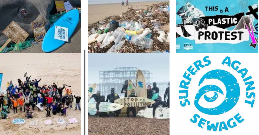

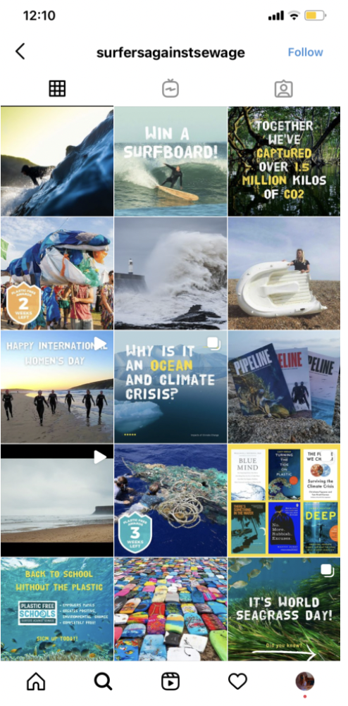
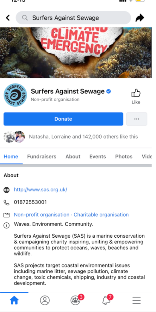
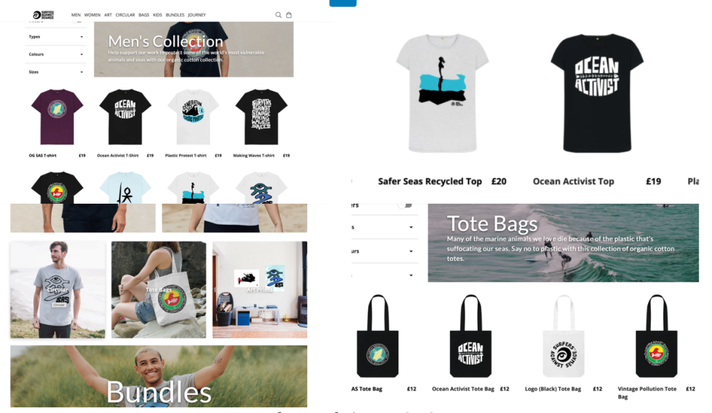
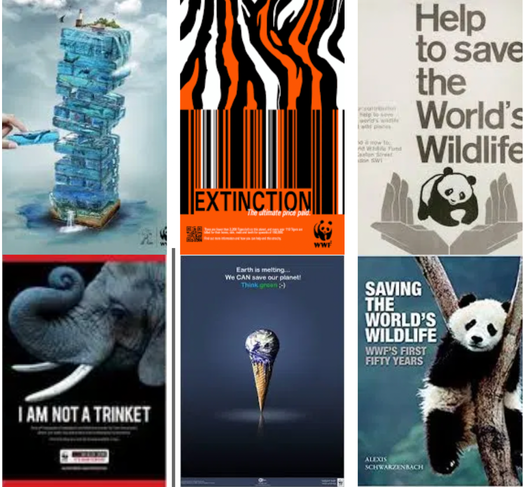
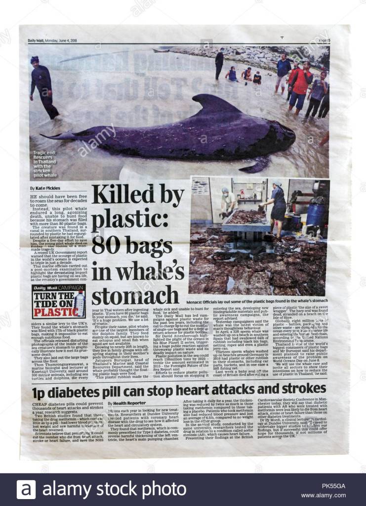


You must be logged in to post a comment.